

We have been working with Central on our design work for the past year. During which they have designed our website, re-designed our web app and keep improving user experience as a whole, its fair to say we love what they do and the way they do it.
Central founder Geoffroy Delobel, recently shared a story about their collaboration with us to transform something that is generally considered basic and functional into a great piece of design which never fails to impress first time recipients. We’re re-posting it here for you:
The story of a 1-week design sprint to redesign an email notification for Proxyclick
We recently ran a Boost session (a 1-week design sprint program we are ramping up at Central) with Proxyclick to rethink a notification sent by email.
Proxyclick provides a great web app that helps companies manage their visitors. We first met Proxyclick in 2013 to re-design their Kiosk app. It was probably the most challenging project we had that year. Drawing on this success, they asked us to rethink their marketing website from the ground up.
During the course of the project, the Proxyclick team was in contact with a famous Silicon Valley company working in the travel industry to bring them their solution. In the end, they decided to go with a local provider but by the time we released the new marketing website, this company was back and had reached out to Proxyclick.
“It would be great if your notification email looked beautiful as your new website”
The email in question is the notification email the host receives when his visitor checks-in at the reception. For a long time Proxyclick has wanted to redesign this email. They had plenty of ideas about and a free slot in their roadmap to do this quickly. This feature was the perfect opportunity for a quick Boost sprint. We presented how Boost works and they jumped in.
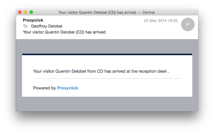
The original notification email.
Day 1 — Plan
On day one, Geoffroy De Cooman, Product Owner at Proxyclick, joined Loucas and Quentin during a 2 hour meeting to define and plan the sprint. Central would prototype the feature, design the email and deliver the email template to Proxyclick’s development team for implementation.
Together we set the goals and initial direction for this redesign:
- We wanted the email to go beyond being simply a notification email.
We wanted it to be useful. - We wanted the visual design to reflect the app overall look and feel.
- We wanted people to go wow! As it’s the first notification people get when doing a trial, it needed to convey Proxyclick’s culture for going beyond expectations.
We wrapped up the day by clarifying any technical or logistical issues and Geoffroy shared their early ideas about the notification.
Day 2 — Workshop
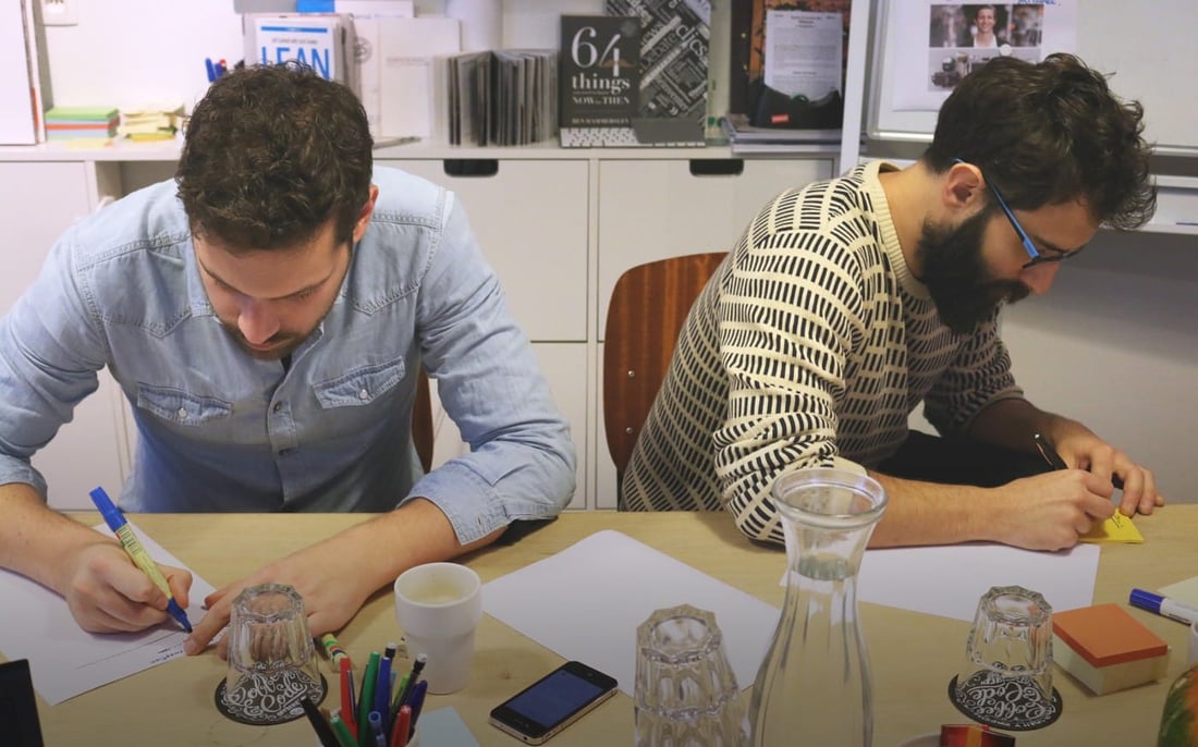
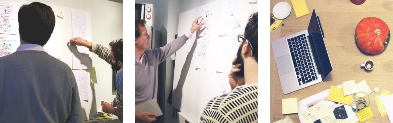
On the second day we came armed with our previous day’s research and ready to tackle the problem. We knew it was not going to be just an email notification.
We setup the Boost stage –our lovely kitchen-meeting-room– with a stock of post-its, markers, boards, fresh drinks, great coffee and snacks. Geoffroy joined us for a half-day workshop and we got cracking.
Set the context
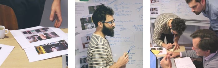
We sketched the user journeys and the actors involved throughout their story. We quickly drew our personas to portray their goals within the scenario and started telling the story:
- What happens before a visit and on the day of a visit?
- What notifications are sent and how?
- Who is interacting with whom?
- What data can Proxyclick capture?
Ideate & diverge
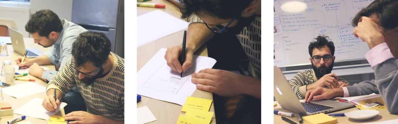
Next, we started connecting the dots and asked ourselves “How might we?” questions to reveal opportunities for genuine solutions. We drew crazy eights, 8 rapid sketches in 5 minutes –that’s right, 40 seconds per sketch– to crank out variations of ideas quickly. The rapid pace of this exercise doesn’t allow for one to self-edit and just get ideas on paper quickly.
Converge & wireframe
Our ideas of the user journeys started to fall into place and we drew a more concrete picture of the situation. Our storyboard showed us how a user would move through each part of the story. Then we focused on the notification email itself. During 10 mins each of us, individually, tried to make sense of the ideas and sketch wireframes of the emails. We posted our ideas on the wall and critiqued them together. We reworked the one idea that looked the most promising and ended the workshop there. The rest would be done by our team.
By the end of the day, it was hard for us to believe how much we’d actually managed to do in just one half a day. Working together with our client allowed us to tap in to all the knowledge and intricacies we needed to know before we could start designing. It was design on steroids.
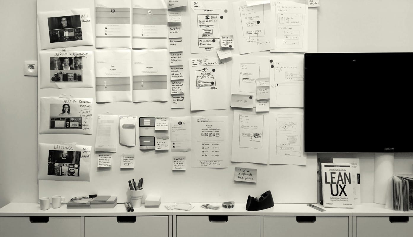
The project board at the end of the design workshop.
Day 3 and 4 — Building it
Look & feel
During Day 3 we brought together all the people we needed to build a successful notification email. Loucas refined the wireframe and validated it with the team. Quentin then went on to tackle the visual design and made a mock-up of the final look of the email in Sketch. Sarah refined the copy of the email and made sure it followed the voice and tone of the Proxyclick app.
Test and build
At the end of day Loucas and Quentin used Invision to setup a quick real life demo. They transformed our kitchen into a temporary reception desk and the team played the different roles of the visitor journey to simulate the entire process.
On Day 4 Quentin refined the mock-up from the feedback we shared following our role play. David then coded the email template and delivered it to the Proxyclick’s development team.
In just one week, thanks to a framed and collaborative approach, we developed and implemented something basic into a powerful idea.
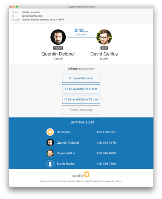
The new notification email
"What takes four weeks to execute, took us one week"
Not only did Proxyclick quickly implement a new feature and add value to their product, they also left with a bag full of inspiring design explorations that we created during the workshop.
Now we are monitoring how people use the new notification email. We have made a hypothesis and tested it ourselves but nothing will replace the real experience. You can never be certain how a user will really use it.
If the users adopt the new feature, we will probably need to make refinements based on observation and user feedback. And if it doesn’t take off, we will embrace what we learnt to progress faster.