


We’re happy to announce that we’ll shortly bring significant improvements to the design of your Service Desk. You’ll be able to test the improved design as of October 22nd, while the current design will be phased out end of November.
Find out more below about:
- The main improvements
- The rollout plan
We are excited to share the details with you as we took the best of our work on the Visitor Management Dashboard and applied it to the Service Desk.
Main improvements at a glance
Better overview
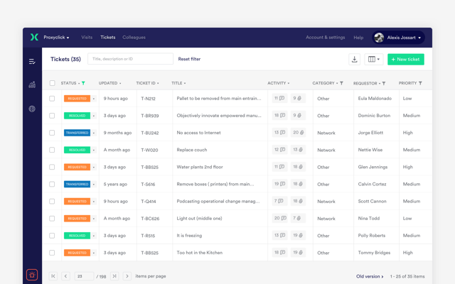
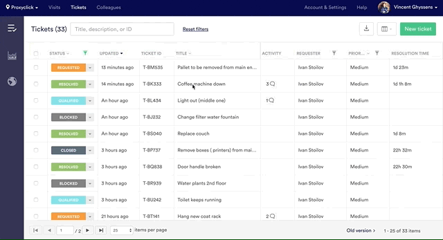
Our first decision was to structure the list like a table from now on. This allows you to see more information in a more structured way. Every field is now a column, which makes filtering and sorting quicker and more intuitive. In addition, the table allows to see approximately twice as many tickets in one view than before.
Much faster navigation to visit details
We worked very hard on the code to make the whole site much more reactive and faster.
Next to that, we also reviewed some key features to make them much faster. The best example is probably how you look at the details of a ticket.
Users told us it took quite some time to navigate between tickets in the previous version. You had to click on the ticket title, open a full page, reload the full list and repeat the operation. This process is now incomparably faster. You can now see the ticket details sliding from the right without leaving the table which saves you a lot of time.
Manage tickets directly from the table
You can now change the status of a ticket, edit it or perform other actions directly from the table. No need to open it first. Again – a great time saver.
.png?width=640&name=screenshot4%20(1).png)
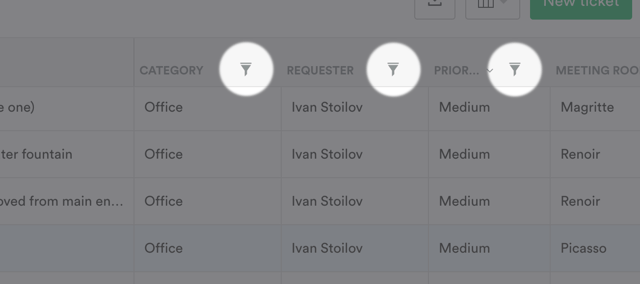
Filters at hand
We know - filters can be very useful. You’ll find them now in the column header. No need to open the filter zone first anymore. In addition, they always remain visible, even when you scroll down.
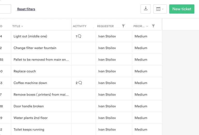
See the fields you want directly from the list
Most of our clients create custom fields of different kinds (meeting rooms, etc). Many were frustrated they could not see them in the list and had to open the ticket for that. Conversely, we often got the feedback that some information displayed in the list was not relevant for them.
Great news for these users: they can now choose what columns to hide/display, including custom fields! And they can do so without worrying about disrupting their colleagues as these preferences are personal.
A keyboard-friendly form
Prefer the keyboard over the mouse? No problem, you can use TAB, ENTER and arrows instead! (This was not the case in the previous version.)

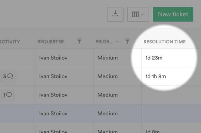
New metric: time to resolution
Many clients need to track the time it took to close or resolve a ticket. This info was already available, but only in the export. We now added it to the table for better tracking!
Planning of the rollout
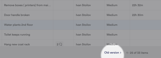
As of October 22nd, you’ll be able to use the new interface. You'll get a short (and optional) tutorial when you log in. If you need some time to get used to it, no problem: you’ll be able to switch back to the “old” version in one simple click.
The definitive roll-out will only take place end of November.
You do not need to adjust any setting or transfer any data as we only worked on the design. You’ll find all your data and existing features intact.
We appreciate any feedback you might have and look forward to receiving it!