

The fall season is already proving to be abundant - at least as far as new Proxyclick features are concerned. This month we’re releasing three new high-impact Dashboard improvements that will help you view, analyze and extract data as never before.
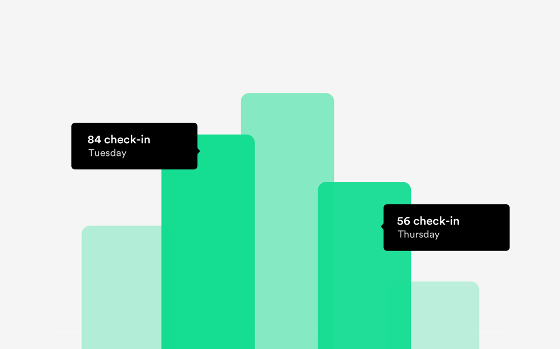
Goodbye Reports, Hello Analytics
Our users already enjoy the ability to track and measure the data on their visitor check-ins via the Report section in the Dashboard.
We decided that we wanted to boost the value of having all this data at hand. We’re allowing all customers to fully leverage the power of visitor data at their fingertips.
From now on, Reports have a new name: Analytics, and come with a completely redone interface that focuses on the data that you need the most to keep your operations optimal.
 At a glance, you’ll now be able to get quick, actionable answers to the top questions that any front desk team or a facility manager wants to know:
- Find out what your peak times are and increase staffing accordingly;
- Detect seasonality and get the monthly breakdown of visitor status so you can plan better;
- Determine if you need to increase your pre-registering efforts for better visitor experience;
- Learn if you need to make special accommodations for hosts that handle an unusually high volume of check-ins.
One other major improvement is the new ability to choose the reporting period; from now on you can choose from Last Week, Last Month, 6 Months or a Custom period.
Faster Exports
As part of our focus on the Analytics this month, we’re also making it a lot easier for you to go a step further and “play” with the raw data through Exports.
Exporting all visitor data is now a lot faster due to a completely reviewed code and re-engineering of its technical aspect that now allows very large exports as well.
You’ll also notice the secure link to your export is now sent via email, so you can continue working while we’re processing your export.

Last but not least, the Export button is now also a lot easier to find - it now lives on the top right of your Dashboard after login so you’ll always be just a few clicks away from it.
Building View
The third feature in the spotlight this month is the Building view that makes it possible for you to group multiple locations together into so-called Buildings.
Buildings are a powerful feature that allows you to perform actions on several related locations at once.
This will especially make a difference for two types of companies:
- Large corporations that have multiple subsidiaries in need of aggregating locations within the Dashboard for further manipulation;
- Property management companies operating buildings with many tenants.
Using buildings has two clear benefits for these companies:
- The ability to download the emergency lists for all grouped locations at once;
- The ability to export all the data per Building for all locations within.
Creating and managing Buildings is easy - clicking the Location Overview on the left side of your Dashboard will take you to a screen where you can see all your locations along with some key pieces of data. Then it’s just a matter of grouping them together into Buildings.
Small Visual Changes to The Dashboard
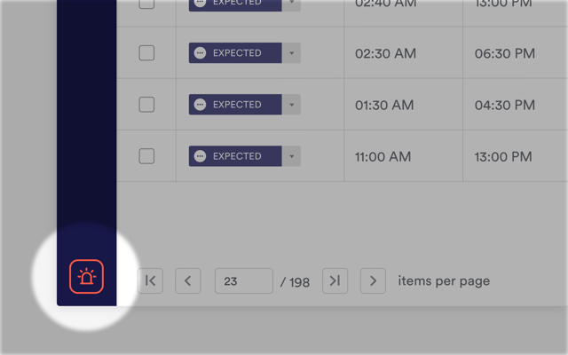 As the icing on the cake, we’ve also made some small visual changes to the Dashboard:
- The date picker has been reviewed for more clarity;
- A new, more relevant emergency icon.
The changes you see are the result of us continuously (and consciously) keeping a lookout on how to help you get the most of your visitor check-in system.
We love hearing from you on what our next improvements should be, so go ahead and share your thoughts below.