


This is the story of a curve powerful enough to not only shape a company’s product strategy, but an entire industry.
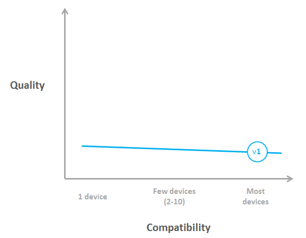
This curve expresses the relationship between 2 attributes of a product (in our case software) - its quality and its compatibility with multiple environments.
Of course, every product manager will want their product to score the highest on both dimensions. Quality to wow and convert prospects (and delight clients over the long run) and compatibility to appeal to the largest possible market.
As you know this is not possible.
Indeed, there is an intrinsic negative correlation between quality and compatibility.
When you develop for multiple environments you're forced to make compromises. The best approach to do something on one platform is often not possible on another one. So you settle on a sub-optimal approach that works on all platforms.
As an example, consider nice transitions between screens on an iPad (e.g. when the screen "flips"). These cannot be managed correctly on a browser-based app. So, if you develop a single piece of software that needs to run both on a PC and an iPad, your screens on iPad will just appear the one after the other; without nice transitions.
The inevitable consequence as we move to the right of the graph with increasing compatibility, is that quality decreases.
The top right corner being impossible, the question is then should you focus on quality or on compatibility?
The answer is: It depends.
It depends on many factors such as the shared characteristics of the different environments, the competition in the marketplace and the importance of quality.
It also depends on 2 key elements I’d like to illustrate with the story of our software:
- the shape of the curve and its position. Different curves call for different strategies.
- the curve can change over time. Different times call for different strategies.
These are the 2 points I’d like to illustrate with the story of our software, a self-check-in kiosk which companies use to register incoming visitors to their offices.
2010: Easy choices, bad quality
The story begins in 2010. We’ve just released the first version of our kiosk. It is browser-based software that turns PCs with a physical keyboard or “touch PCs” into a self-check-in kiosk. The iPad did not exist yet.
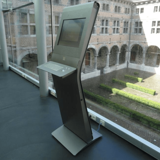
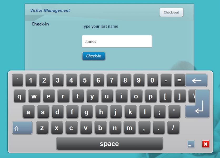
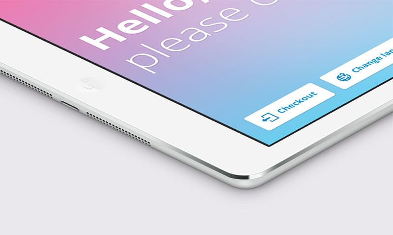
The check-in screen before the iPad
In order to make it work on all these touch PCs, we developed our own Javascript virtual touchscreen keyboard. Why did we make it compatible with so many devices? Well, there was not much to gain from focusing on 1 device, as the quality would not improve: the curve was quite flat.
In fact there was quite a lot to lose from going left, as no dominant hardware had really emerged.
The second characteristic of the curve at the time was its low position. In other words (let’s admit it) the quality of the touch experience was really poor (at least with our 2015 eyes and fingers).
The first version of our kiosk app (browser-based)
I even recall that one of our customers was so fed up that he transformed its human-sized kiosk into a coat rack! The technology was just not ready. Most companies preferred to let receptionists type visitors’ names on their screen. And if a company installed a kiosk, it was most often a regular PC with a mouse and a reliable physical keyboard.
2011-14: Stuck in the middle?
Then the iPad was released, followed by other tablets.
And it profoundly affected the curve. The slope became steep. In particular, the touch user experience was way better than on touch PCs (fast and precise letter typing, fixed keyboard). As a result, dropping our Javascript keyboards in favor of the native tablet keyboard created a big jump in quality. We made that step in the second version of our kiosk and considerably reduced the number of devices we supported.
Still, we did not go to the extreme left (i.e. develop a native iOS app). True, extra quality would have been the reward (e.g. faster screen transitions) but this was not enough.
An iOS app would have reduced our ability to address the market because our browser-based kiosk was compatible with iPad, Android, Windows 8.1, and regular PCs. I felt at this stage that an iOS app would not compensate for this reduction.
As the quality increased sharply, we witnessed 2 other trends in the market:
- An increase in the number of clients who installed a kiosk. Once an exception, it became the norm
- A growing intolerance to poor quality, as every visitor was a tablet user at home
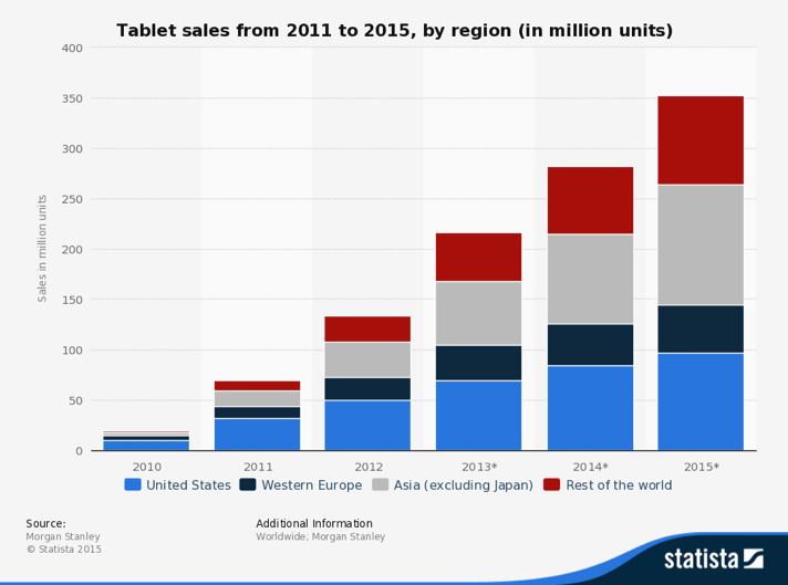
Tablet sales multiplied by 20 between 2010 and 2015
2015: Go native or die
It’s been 5 years since the iPad came out and successive new versions were released. Again, the curve changed considerably: It skewed.
In other words, the quality of native apps increased faster than the quality of browser-based apps. Even though iPad improvements like retina screens and faster processors benefited both types of apps, some key new features only benefited native apps. Let me give you 2 examples:
- A front facing camera was released with the iPad 2 and made it possible to take a picture of the visitor or to scan a code for faster or pre-approved check-in
- Airprint made it possible to print directly from the iPad, without the need for an intermediary PC
In other words, the cost of not going native just became too high. We would miss out on the advantages of integrating photographic imaging of visitors or QR code check-in and offering smooth transitions between screens. We are now about to release the 3rd version of our kiosk. It is an iOS app, and we’ve invested massively in it.
Had the curve remained flat, we would probably still be at the right of the graph.
But it didn’t.
So we adapted our product strategy. And witnessed a profound shift in our market: Reception activity has been desktop centric for decades. In just 18 months or so, Visitor Management has become a kiosk-centric offering.
What about you? What does the curve look like in your market? How did it evolve? How is it likely to evolve? What does it take to move your product to the right (and down) or to the left (and up)?